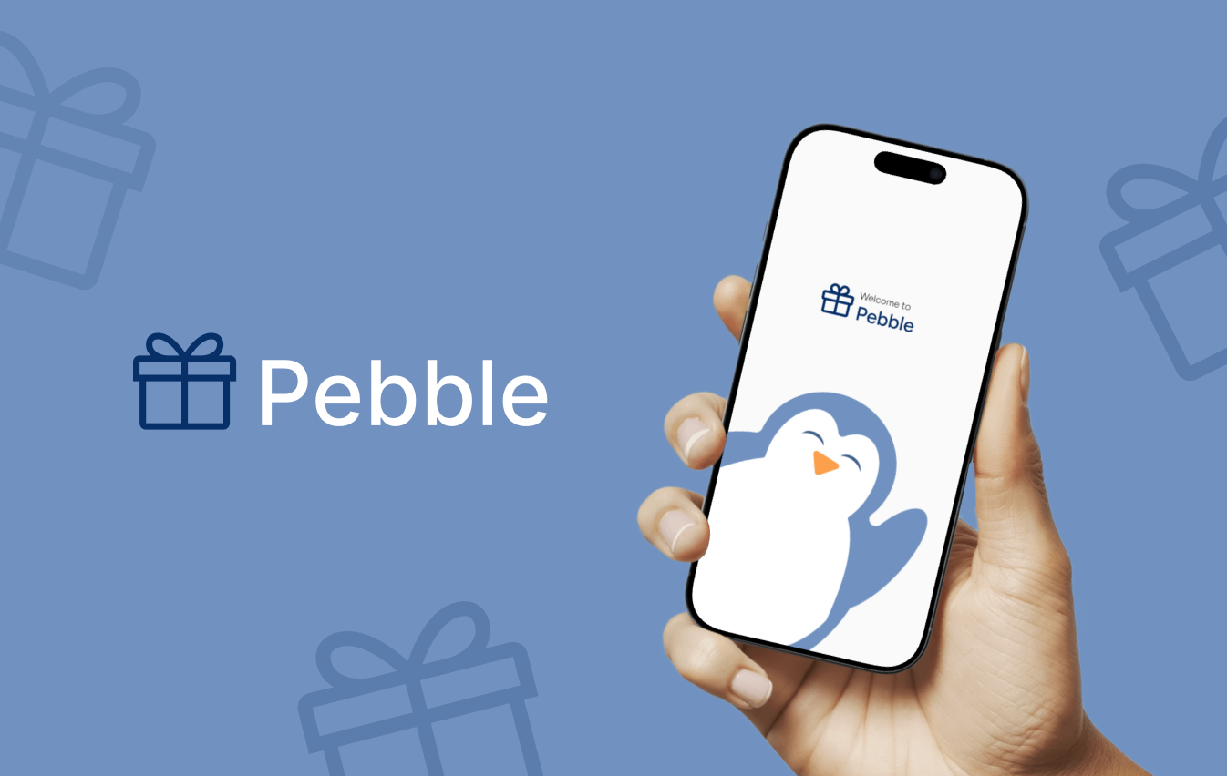
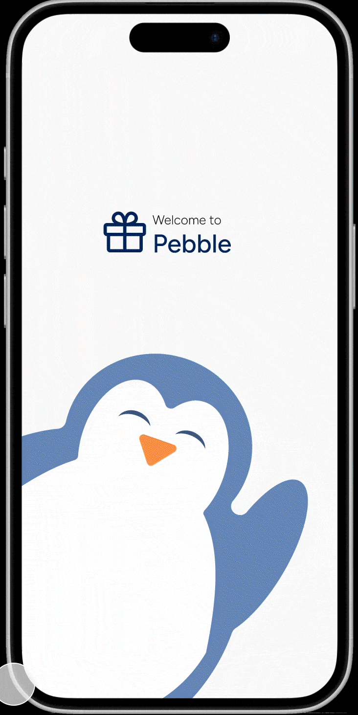
Pebble🐧🪨
A gift-giving app where users build and share customized wishlists to discover thoughtful and niche presents.
UI & Brand Designer
6 Weeks
1 PM and 4 Designers
Duration
Role
Team
INTRODUCTION
The Project
Pebble is a mobile app that helps users find the perfect gifts for loved ones through personalized profiles, curated “For You” pages, thoughtful notes, and customizable product boards.
Through intuitive design and engaging interactions, Pebble transforms the often stressful task of finding the right gift into a joyful and personal experience.
THE PROBLEM
Finding The Perfect Gift
Imagine: You meant to plan ahead, but forgot what you had in mind — and now your friend’s birthday is two days away. You’ve scrolled Amazon, skimmed gift guides, even asked ChatGPT, but nothing feels right. A candle? Too basic. A funny mug? Already gave her one. Your cart’s full of last-minute, impersonal picks.
“How might we make it easier to find personalized gifts that reflect a friend's unique hobbies or tastes?”
Understanding The Gifting Process
RESEARCH
Goals: Better understand how people approach gift-giving and to validate the idea that finding a meaningful and unique gift can be a difficult and time-consuming task.
Research Methods: surveys, user interviews, and a competitive analysis
Key Research Data: I searched for common patterns and identified strengths and weaknesses among the results that could influence my design patterns and potential areas for innovation.
Findings:
gifting is a highly emotional and personal process
that finding the right gift is stressful and inefficient
and that there's a clear need for better tools to organize and collaborate
Creating The Gifting Journey
USER FLOWS & LOFI WIREFRAMES
User Flows: I mapped 2 flows to get a clear idea of how the user would navigate to complete the task of sending a poll in a chat and the onboarding.
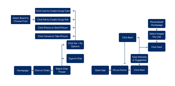
Lo-Fi Wireframes: I created various different wireframes of the onboarding, home page, profile, countdown, and chat screens. At this point of the project my team decided on the idea of a penguin as our mascot, so I played around with that.

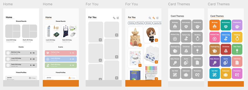
MIDFI WIREFRAMES & USABILITY TESTING
Refining The Experience
Mid-Fi: I took my low-fi wireframes and developed them slightly further to prepare for usability testing. Here’s a quick side by side comparison of the wireframes.
Usability Testing: I asked participants aged 19–22, mostly students and young professionals to complete three main tasks:
Find a friend’s wishlist
Send a personalized note
Create their own wishlist or board
Testing revealed a few key issues, but these insights guided the next design iteration, leading to simpler navigation and a revised branding color palette.
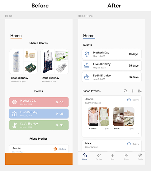
Takeaway #1: Home
“I would prefer to see the events first at the top of home then my friends profiles.”
“It’s hard to read the white text in the colored event blocks.”
“The event icons are a bit misleading, since they don’t look like the event is for a birthday.”
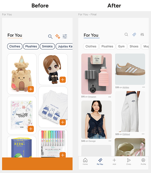
Takeaway #2: For You
“The bright orange reminds me a lot of the app TEMU.”
“I like the categories but the stroke is a bit distracting.”
“I wish the plus button wasn’t covering the product image and that there were more information that’s easy to access.”
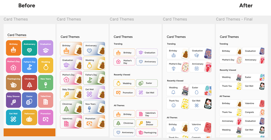
Takeaway #3: Cards
“I wish I could see a preview of
what the cards look like.”
“The gradient feels out of place since it’s not used anywhere else.”
“Using both icons and the card preview feels too content heavy.”
DESIGN SYSTEM
Bringing Pebble To Life
Penguins are known for giving pebbles to their loved ones — a small but meaningful gesture that inspired both our brand name and mascot.
Since my lo-fi wireframes, I had a clear vision for Pebble’s visual identity: something familiar, approachable, and full of personality. Many of my early wireframes influenced the final design system, from rounded and soft color transitions.
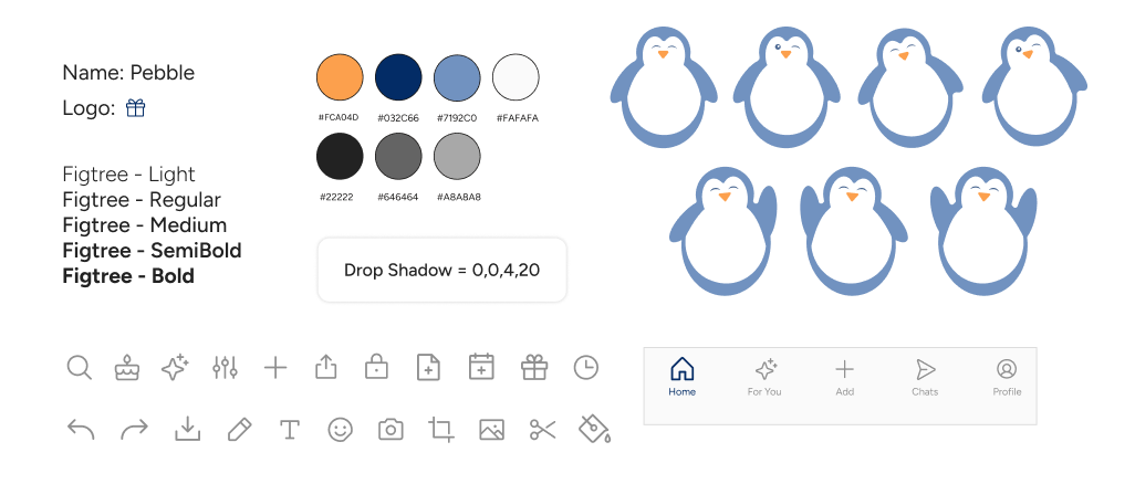
After usability testing, I shifted the original orange palette to a blue-centered color palette to avoid the hash contrast that reminded users of TEMU and create a calmer user experience.
Additionally, I updated our penguin mascot, changing it from a classic black and white penguin with the app’s signature blue for stronger brand cohesion.
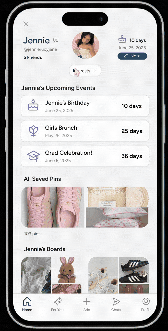
FINAL DESIGNS
Putting It All Together

Presenting Pebble and Key Takeaways
REFLECTION
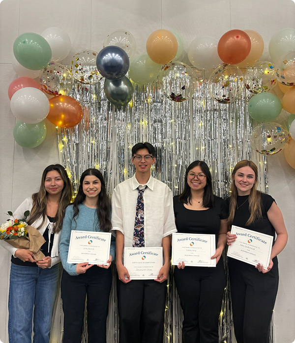
During our final presentation, my team and I walked the judges through our research, design process, and prototype. Daniel Amara, VP of UX at Movano Inc., praised the clarity and market potential of our design and encouraged us to refine navigation and expand our color palette.
Challenges: Deciding which features would be most valuable to users and ensuring our design system stayed accessible and consistent.
Next Steps: I plan to refine our penguin mascot, add personalized gift recommendations, and run another round of usability testing to strengthen
the overall experience.